Patient Support App
Soulfx Technologies
Soulfx's Patient Support Application is a web-based platform developed for a healthcare firm. It facilitates the remote management and operation of a service that provides financial assistance to Canadian patients for medical payments such as prescriptions and therapy.
Client: Multinational healthcare firm
Role: Software designer
Platform: Desktop Web
Result: Enabled virtual-first healthcare delivery during COVID-19 by facilitating administration of over 2.5K medical records
Due to a non-disclosure agreement, mockup components that would contain manufacturer, program or drug names have been populated with placeholder text.

Overview
Soulfx Technologies Inc is a Mississauga-based software consulting firm that focuses on creating applications for clients within the healthcare industry.
Alongside another designer, four developers, a product owner and a project manager, I worked closely with a multinational client in executing an end-to-end project.
Context
COVID-19 has brought with it a global-scale challenge that has pushed the capacity of our healthcare industries to their limits. Our client approached us with the objective of moving their financial aid service online—a shift towards web-based operations aimed at mitigating the risks imposed by the pandemic on immunocompromised individuals.

An outline of our approach
Our Client's Assistance Service
Manufacturers registered under our client's service platform offer their own collection of financial assistance and/or therapy program plans, which provide prescription certificates. These certificates in turn can be redeemed by patients for reimbursements upon purchasing select drugs.
Jobs-to-Be-Done
We designed our client's application from the ground up—however, we worked with a service that was already in operation. Thus, we conducted generative research with the intention of identifying our user groups and what outcomes each group wants to achieve by interacting with our platform.
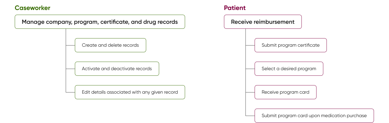
Our user groups and objectives
The Reimbursement Lifecycle
We sought to get an in-depth look at how the support platform itself works and how our users interact with it. I created a lifecycle diagram to document the steps taken from onboarding a new manufacturer to distributing the manufacturer's program cards to patients.
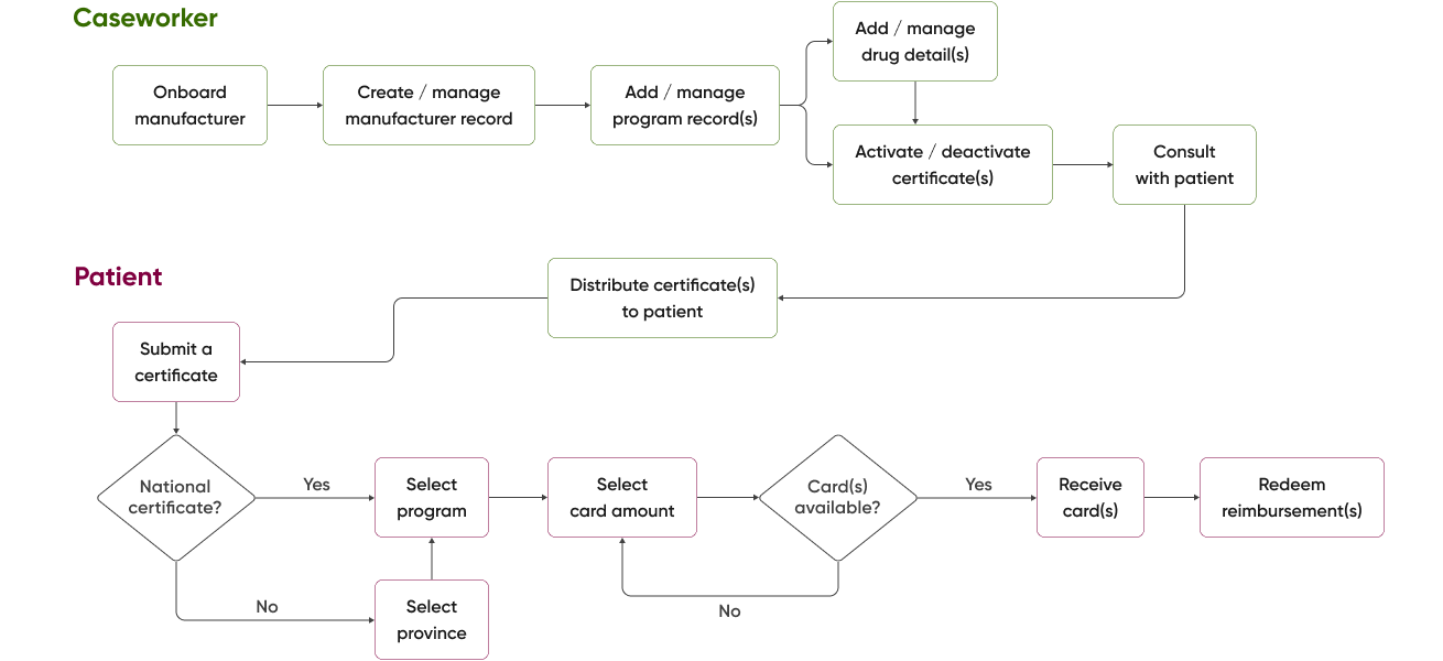
End-to-end reimbursement flow
National-level certificates enable reimbursement access to patients regardless of province, while provincial-level certificates restrict a program's availability to specified provinces. Furthermore, the availability of cards offered by programs continuously fluctuate based on demand.
Record Information Architecture
I took this as an opportunity to create an architecture diagram and illustrate a granular view of the details being managed within each tier of information.
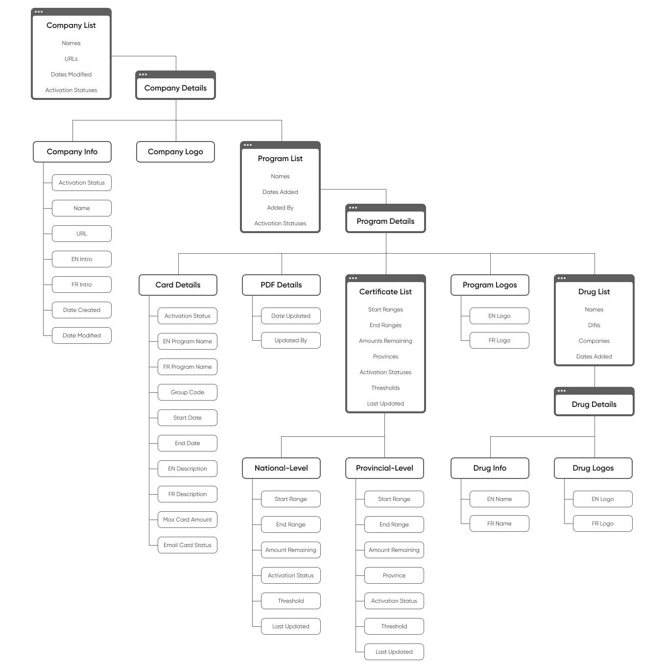
Visualizing architecture made it easier to keep track of how records are structured
Due to the limited amount of time we had to develop a comprehensive understanding of our client's support program, these flows would play a critical role later in the project with ensuring alignment with our developers.
Our Designed Solution
Our designed solution is an application consisting of two components: a record management dashboard for our caseworkers and a small public-facing portal for our patients to retrieve program cards through.
Record Management Dashboard
We employed a single-column layout to allow caseworkers to quickly scan top-down through lists and record details—this pattern is kept consistent across all tiers of information.


Company and certificate record lists


Company and program record details


Record additon
Public-facing Portal
We aimed to make the card retrieval screens as simple as possible for our early adopters and easy to navigate using both desktop and touch inputs.


Program selection and card retrieval
Key Interactions
We wanted caseworkers to be able to efficiently add, delete, and edit records pertaining to any manufacturer, program, certificate, and drug. Additionally, they must be able to make changes to the provincial or national availability of any given program.
Breadcrumb Navigation
Breadcrumbs simplify the dashboard navigation experience by reducing the number of clicks required to access higher-order screens from lower tiers of information. Our caseworkers often have to make changes to a company's details editing a program or certificate—breadcrumbs mitigate the need to repeatedly click the “Back” button.

Activation Switches
Manufacturers frequently make changes to the programs and certificates they offer, and will occasionally switch between servicing at the provincial and national levels. Activation switches serve as visual indicators that display the status of company, program, and certificate records.

We also placed activation switches at the list level for certificates to avoid the need for caseworkers to navigate to each individual certificate's property screen to activate or deactivate it. Activating a national-level certificate will automatically disable any active provincial-level certificates, and vice versa.

Next Steps and Takeaways
There are still opportunities to streamline the navigation experience for our dashboard solution.
Features I would explore next include search and filter functions. As the number of registered records within the platform grows, scrolling to find items within lists may become more laborious. The ability to search for and filter items would address such issues by providing our caseworkers direct access to the records they need to work with.
Designs are products of curiosity and collaboration.
A concrete understanding of our client's service in conjunction with our users' expectations with the product were critical to the execution of each design phase. Working on this project taught me that effective designs are created by working side-by-side with people who possess varying domains of knowledge, some of which may not overlap.
We can utilize design to help out our essential industries, even amid a pandemic.
I do not have the resources nor the know-how to help patients with their medical expenses, but a critical element of my role as a designer was to learn about the people who do. The project provided an opportunity to leverage this understanding and contribute to improving accessibility to healthcare services through design.